Child of the Vine is a modern activewear and streetwear label built on faith, community, and purpose. The brand’s mission is to promote spiritual growth and spread God’s word through bold design. I was responsible for developing the visual identity — creating a logo that reflects both the brand’s modern street influence and its deeper spiritual roots.
Concept Development
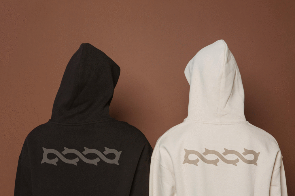
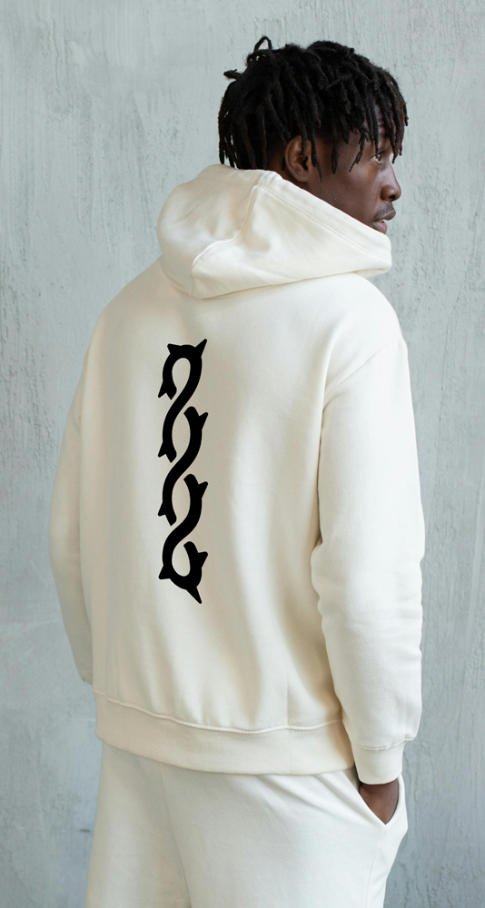
The design process began with extensive sketching, exploring different ways to merge two central themes: the vine and the crown of thorns. The goal was to symbolize growth, resilience, and redemption in a single, unified form. Through iteration, the design evolved into a continuous, looping mark that intertwines both ideas — the organic movement of a vine paired with the sharp, structured rhythm of thorns. The result is a mark that feels both modern and ancient, minimal yet deeply meaningful.
Execution & Style
The final logo balances spiritual symbolism with a streetwear edge. Its bold silhouette reads clearly at any scale — from embroidered patches on hoodies to digital use across social media. The repetition and flow of the line create an almost rhythmic movement, mirroring the cyclical nature of growth and faith. By pairing gothic inspiration with clean geometry, the brand achieves a tone that’s equal parts devotion and rebellion — a perfect reflection of its message.
Outcome
Child of the Vine is more than a clothing brand — it’s a visual reminder to stay rooted in God’s truth. The identity reflects growth through faith, perseverance through trials, and the call to live set apart from the patterns of the world. Each piece is designed to spark conversation and inspire others to walk boldly in the purpose God has called them to.